I’m at the Sanger Institute for just another two weeks before the next stop of my Summer Research Tour and it’s about time I checked in. For those of you who still thought I was in Aberystwyth working on my tan1 I suggest you catch up with my previous post.
The flagship part of my glorious return to Sanger is to try and finally conclude what was started last year in the form of my undergraduate disseration. Let’s revisit anticipated tasks and give an update on progress.
Recall in detail what we were doing and figure out how far we got
*i.e.* Dig out the thesis, draw some diagrams and run
lseverywhere.
This was easier than expected, in part because my thesis was not as bad as my memory serves but also thanks to Josh’s well organised system for handling the data towards the end of the project remaining intact even a year after we’d stopped touching the directory.
Confirm the Goldilocks region
It would be worth ensuring the latest version of
Goldilocks(which has long fixed some bugs I would really like to forget) still returns the same results as it did when I was doing my thesis.
As stated, Goldilocks has been significant revamped since it was last used for this quality control project. Having unpacked and dusted down the data from my microserver2, I just needed to make a few minor edits to the original script that called Goldilocks to conform to new interfaces. Re-running the analysis took less than a minute and the results were the same, we definitely had the “just right” region for the data we had.
Feeling pretty good about this, it was then that I realised that the data we had was not the data we would use. Indeed as I had mentioned in a footnote of my last post, our samples had come from two different studies that had been sequenced in two different depths, one study sequenced at twice the coverage of the other and so we had previously decided not to use the samples from the lesser-covered study.
But I never went back and re-generated the Goldilocks region to take this in to account. Oh crumbs.
For the purpose of our study, Goldilocks was designed to find a region of the human genome that expressed a number of variants that are representative of the entire genome itself — not too many, not too few, but “just right“. These variants were determined by the samples in the studies themselves, thus the site at which a variant appeared in could appear in either of the two studies, or both. Taking away one of these studies will take away its variants having a likely impact on the Goldilocks region.
Re-running the analysis with just the variants in the higher-coverage study of course led to different results. Worse still, the previously chosen Goldilocks region was no longer the candidate recommended to take through to the pipeline.
Our definition of “just right” was a two-step process:
- Identify regions containing a number of variants between ±5 percentiles of the median number of variants found over all regions, and
- Of those candidates, sort them descending by the number of variants that appear on a seperate chip study.
Looking at the median number of variants and the new level of variance in the distribution of variants, I widened the criteria of that first filtering step to ±10 percentiles, mostly in the hope that this would make the original region come back and make my terrible mistake go away but also partly because I’d convinced myself it made statistical sense. Whatever the reason, under a census with the new criteria the previous region returned and both Josh and I could breathe a sigh of relief.
I plotted a lovely Circos graph too:
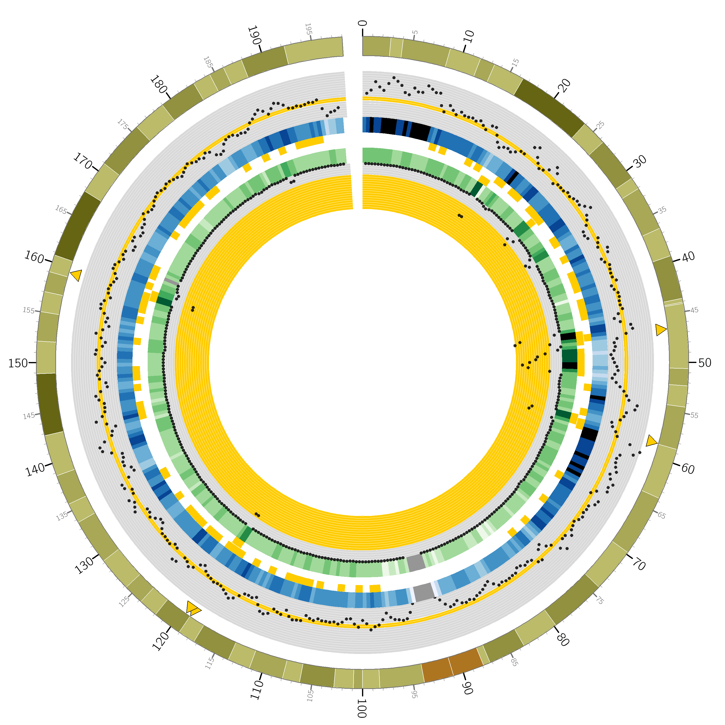
You’re looking at a circular representation of chromosome 3 of the human genome. Moving from outside to inside you see: cytogenetic banding, a scatter plot of counts of variants at 1Mbp regions over the whole-genome study, a heatmap encoding the scatter plot, “Goldiblocks” where those variant counts fall within the desired ±10 percentiles of the median, followed by a second ring of “Goldiblocks” where variant counts fall in the top 5 percentiles of the seperate chip study, a heatmap and scatter plot of variants seen at the corresponding 1Mbp regions in the chip study.
Finally, the sparse yellow triangles along the outer circle pinpoint the “Goldilocks” candidate regions: where the inner “Goldiblocks” overlap, representing a region’s match to both criteria. Ultimately we used the candidate between 46-47Mbp on this chromosome. Note in particular the very high number of variants on the chip study at that region, allowing a very high number of sites at which to compare the results of our repeated analysis pipeline.
Confirm data integrity
The data has been sat around in the way of actual in-progress science for the best part of a year and has possibly been moved or “tidied away”.
There has been no housekeeping since the project stalled, presumably because Sanger hasn’t been desperate for the room. In fact, a quick df reveals an eye watering ~6PB available distributed over the various scratch drives which makes our ~50TB scratch cluster back in Aberystwyth look like a flash drive. Everything is where we left it and with a bit of time and tea, Josh was able to explain the file hierarchy and I was left to decipher the rest.
But before I talk about what we’ve been doing for the past few weeks, I’ll provide a more detailed introduction to what we are trying to achieve:
Background
Reminder: Project Goal
As briefly explained in my last post, the goal of our experiment is to characterise, in terms of quality what a “bad” sample actually is. The aim would be to then use this to train a machine learning algorithm to identify future “bad” samples and prevent a detrimental effect on downstream anaylsis.
To do this, we plan to repeatedly push a few thousand samples which are already known to have passed or failed Sanger’s current quality control procedure through an analysis pipeline, holding out a single sample in turn. We’ll then calculate the difference to a known result and be able to reclassify the left-out sample as good or bad based based on whether the accuracy of a particular run improved or not in their absence.
However, the explanation is somewhat oversimplified but to get more in depth, we’ll first have to introduce some jargon.
Terminology: Samples, Lanes and Lanelets
A sample is a distinct DNA specimen extracted from a particular person. For the purpose of sequencing, samples are pipetted in to a flowcell – a glass slide containing a series of very thin tubules known as lanes. It is throughout these lanes that the chemical reactions involved in sequencing take place. Note that a lane can contain more than one sample and a sample can appear in more than one lane; this is known as sample multiplexing and helps to ensure that the failure of a particular lane does not hinder analysis of a sample (as it will still be sequenced as part of another lane). The more abstract of the definitions, a lanelet is the aggregate read of all clusters of a particular sample in a single lane.
Samples are made from lanelets, which are gained as a result of sequencing over lanes in a sequencer. So, it is in fact lanelets that we perform quality control on and thus want to create a machine learning classifier for. Why not just make the distinction to begin with? Well, merely because it’s often easier to tell someone the word sample when giving an overview of the project!
Terminology: Sample Improvement
A sample is typically multiplexed through and across many lanes, potentially on different flowcells. Each aggregation of a particular sample in a single lane is a lanelet and thus these lanelets effectively compose the sample. Thus when one talks about “a sample”, in terms of post-sequencing data, we’re looking at a cleverly combined concoction of all the lanelets that pertain to that sample.
Unsimplifying
The Problem of Quality
When Sanger’s current quality control system deems that a lanelet has “failed” it’s kicked to the roadside and dumped in a database for posterity, potentially in the hope of being awakened by a naive undergraduate student asking questions about quality. Lanelets that have “passed” are polished up and taken care of and never told about their unfortunate siblings. The key is that time and resources aren’t wasted pushing perceivably crappy data through post-sequencing finishing pipelines.
However for the purpose of our analysis pipeline, we want to perform a leave-one-out analysis for all lanelets (good and bad) and measure the effect caused by their absence. This in itself poses some issues:
- Failed lanelets aren’t polished
We must push all lanelets that have failed through the same process as their passing counterparts such that they can be treated equally during the leave-one-out analysis. i.e. We can’t just use the failed lanelets as they are because we won’t be able to discern whether they are bad because they are “bad” or just because they haven’t been pre-processed like the others. -
Failed lanelets are dropped during improvement
Good lanelets compose samples, bad lanelets are ignored. For any sample that contained one or more failed lanelets, we must regenerate the improved sample file. -
Polished lanelets are temporary
Improved samples are the input to most downstream analysis, nothing ever looks at the raw lanelet data. Once the appropriate (good) processed lanelets are magically merged together to create an improved sample, those processed lanelets are not kept around. Only raw lanelets are kept on ice and only improved samples are kept for analysis. We’ll need to regenerate them for all passed lanelets that appear in a sample with at least one failed lanelet.
The Data
The study of interest yields 9508 lanelets which compose 2932 samples, actual people. Our pipeline calls for the “comparison to a known result”. The reason we can make such a comparison is because a subset of these 2932 participants had their DNA analysed with a different technology called a “SNP chip” (or array). Rather than whole genome sequencing, very specific positions of interest in a genome can be called with higher confidence. 903 participants were genotyped with both studies, yielding 2846 lanelets.
Of these 903 samples; 229 had at least one lanelet (but not all) fail quality control and 5 had all associated lanelets fail. Having read that, this is tabulated for convenience below:
| Source | Lanelets | Samples |
|---|---|---|
| All | 9508 | 2932 |
| Overlapping | 2846 | 903 |
| …of which failed partially | 339 | 229 |
| …of which failed entirely | 15 | 5 |
But we can’t just worry about failures. For our purposes, we need the improved samples to include the failed lanelets. To rebuild those 229 samples that contain a mix of both passes and fails, we must pull all associated lanelets; all 855. Including the 15 from the 5 samples that failed entirely, we have a total of 870 lanelets to process and graduate to full-fledged samples.
The next step is to commence a presumably lengthy battle with pre-processing tools.
tl;dr
- I’m still at Sanger for two weeks, our data is seemingly intact and the Goldilocks region is correct.
Circosgraphs are very pretty.